dilluns, 10 d’abril del 2017

Climbing the peak

Climbing the peak


Scenario

In your usual sizing efforts you need to know the peak usage% for a certain workload and server(s). What is the right averaging time to capture this peak? Let’s see possible choices.

Too long averaging time


Averaging Time = 500 min. Peak usage% = 50%.
Total loss of finer details. Does this really mean that the usage% has been the same for the 500 min? You, like me, don’t believe that!

Too short averaging time


Averaging Time =  10 s. Peak usage% = 100%.

Too much detail. This may be good for performance analysis, but it is confusing for sizing. Spikes goes up to usage%=100%, meaning that for 10 s -the averaging time-  in a row the server is 100% busy. But I wouldn’t consider that the server usage% is 100% for sizing purposes. If you do so you most probably are oversizing, a common (and safe) strategy by the way.

The right averaging time?


Averaging Time =  10 min. Peak usage% = 68%.

Eureka! This is the right amount of detail. In my point of view the right averaging time for OLTP lies somewhere between 10 min and 1 hour, depending on the workload, on the available data, and on the degree of tolerance to a high usage%.

dilluns, 3 d’abril del 2017

The Degraded Operations Pitfall

The Degraded Operations Pitfall


Let's consider an information system supporting a highly critical online activity. Critical means it cannot fail, and if it fails there must be a contingency infrastructure that allows operations to continue "reasonably" well, with zero or tolerable performance impact.

Someone trying to reduce acquisition cost decides having half of the processing capacity in the contingency infrastructure. Should you, as an expert sizer, feel comfortable with this decision or you shouldn't?
To illustrate the problem let us consider that the workload is the SAP SD benchmark (see "Phases of the SAP Benchmark" entry in this blog). The simplified response time curve is in Figure 1, and it can be seen that the system supports 80000 users with a response time of 1 s.
Figure 1: The response time versus the number of users graph for the normal mode server (blue).

If we put this workload in the 50% capacity degraded model infrastructure, that is: the same population,  the same activity, but with 50% less capacity, what happens?  Look closely at the figure 2.

Figure 2: The response time graph for the normal mode server (blue) and for the contingency one (red) with 50% performance capacity.

With a 50% capacity the response time for 80000 users (1 s in the normal mode server) would be around 12 s! Would anyone consider this is an usable system?

How to successfully solve the above situation? Two lines of action are possible:
  • At the workload side: reduce the number of users, that is, propose a significant restriction in the number of users that can use the system in degraded mode.
  • At the capacity side: increase capacity in contingence, that is, increase the capacity  of the contingency server ideally to 100% of the normal mode.

Summarizing: when sizing degraded mode infrastructures you have to pay much attention to the response time, and not only to the bandwidth (maximum throughput),

dilluns, 27 de març del 2017

The upgrade sizing pitfall

The upgrade sizing pitfall


The art of sizing is not exempt of pitfalls, and you must be aware of them if you want your sizing to be accurate and adequate. Let us talk about a typical scenario: a server upgrade.

All the metrics in sizing are measures of throughput, and this has an implication you must take into account: not always the service center (the server, here) with higher throughput capacity is better. What are you saying man?

Let's consider two servers, the base one and its intended upgrade:
  1. Base: single core server with a capacity (maximum throughput = bandwidth) of 1 tps (transaction per second). Therefore the transaction service time is 1 second.
  2. Upgrade: four core server with a capacity of 2 tps. Therefore the transaction service time is 2 seconds.

If you exclusively look at the throughput, B (2 tps) is better than A (1 tps). Period.

But from the response time perspective such a superiority must be revised. Let us graph the response time versus the number of users:

Figure: Best response time (average)  versus the number of users, with a transaction think time of 30 seconds. Server A (base) in blue. Server B (upgrade) in red.

In the light load zone, that is, when there are no or few queued transactions, A is better than B. This is consequence of a better (lower) service time for server A. In the high load zone B is better than A. consequence of a better (higher) capacity (throughput). If the workload wanders in the light zone such an upgrade would be a bad idea.

So when you perform a sizing you must know wich point of view is relevant to your sizing exercise: the throughput or the response time. Don't fall in the trap. A higher capacity (throughput) server is not unconditionally better. For an upgrade server to be unconditionally better its capacity (throughput) must be higher and its service time lower.

dilluns, 20 de març del 2017

What does Usage mean?

What does Usage mean?


My objective today is to clarify the meaning of one of the most used metric in sizing and in performance analysis: the usage.

First things first

The Usage exposes the state of the service center. It is a binary quantity:
  • usage=0 when idle (not working)
  • usage=1 when busy (working)
Any service center at any point in time is idle (usage=0) or busy (usage=1).

Usage Percentage (Usage%)

This is the "usage" metric we are familiarized with. It is the average of the usage over a certain time interval, called the averaging time. Typically is expressed as percentage.

In example usage%=20% (for a certain time interval) means that for that time interval the service center has been:
  • 20% of the time busy
  • 80% of the time idle

Averaging Time

The averaging time for calculating the usage% is of capital importance. Saying 20% is not enough, saying 20% over an hour is right.

Theory is very simple, but in practice the averaging time is frequently dropped. Always ask for it (but don't expect to have a crystal clear response).

To stress its importance look at these graphs representing the time evolution of the usage% metric for the same workload and different averaging time.

Averaging Time = 10 s


Averaging Time = 10 min

Averaging Time = 500 min


I insist: in the three graphs the workload is the same (and the total amount of work done -the area under the usage% curve- remains the same). The short averaging time is best suited for performance analysis, the medium is for sizing, and the long is for trend analysis.

dilluns, 13 de març del 2017

Phases of the response time with variability

Phases of the response time with variability


Let's go to the response time versus the number of users signature (graph below) in the simple system described in "Phases of the Response Time". We made two simplifying assumptions: the service time is constant, and the interarrival time is constant (the the think time is constant). These assumptions allowed us to distill the essence of the response time dependencies, providing us with very useful insights regarding the response time behaviour, the primary parameters it depends on, how it depends on them, and what are its trends and its limits.

Figure 1: The response time versus the number of users for the simple model.


In the real world... variability!

Now let's go a step further introducing the variability. Customers seldom arrive to a service center at uniform intervals (arrivals side variability). Customers seldom demand the same service time (service side variability). Both magnitudes are essentially variable.

The analysis of the response time with variability is usually done using a powerful mathematical tool called probability analysis. Every time you hit into a queueing theory textbook or article, you'll find probabilities. Our constant values are transformed in something like this:  "it's twice more probable to have a service time of 2 s than 1 s", "there's a probability of 80% that service time lies in the interval (1 s, 2 s)", “the average response time is 2 s”, and so on. We enter the probabilistic world, where the raw material is random variables, on which we can only state probabilistic facts.
But, for now, I'm interested in highlighting the main consequences of the variability, not in performing an analytical in-depth analysis.

Variability Effects

Look at the figures 2 and 3.

Figure 2: No variability case. Uniform arrivals + Uniform service --> No waits --> Best and uniform response time.

This "no variability" figure corresponds to our simple all-constant case (Figure 1). Uniform arrivals and uniform service time result in no waits and the best and uniform response time.
Figure 3: With variability case (arrivals side). Non-uniform arrivals + Uniform service --> Waits --> Worse and variable response time

The "with variability" diagram illustrates the arrivals side variability, in particular batch arrival of users. Non-uniform arrivals result in waits, and the response time seen by users is worse and variable (or volatile).

Ideas to take -->  Variability effects are:

  • The response time is variable: the response time varies from user to user and from successive visits from the same customer.
  • The average response time is worse: waits show up due to the lack of uniformity. increasing the response time.

An analysis of the same simple model but allowing  random -exponentially distributed- variation of the service time and the think time results in the graph in figure 4.


Figure 4: Average response time for the all-constant (blue) and the random (red) cases..

We can see, for example, that when the user population reaches  80% of the saturation value the average response time for the random model is 4 times the one for the all-constant model, and for 100% of the saturation population the ratio increases to 8 times!

By the way. don’t underestimate the effects of the variability, as it is one of the causes of unacceptable performance from the customer point of view: in general a customer is willing to accept higher but uniform response times than lower but highly variable ones.

dilluns, 14 de novembre del 2016

Data Tiering: a simple performance analysis


A certain transaction uses 1 ms of cpu time and 20 ms of IO time. With a think time of 10 s the system supports 550 users with a response time R below 1 s.

Now the same system is equipped with a faster storage where part of the data is placed. When this data replacement is automatic, the faster storage is acting as a cache. If the transaction finds the data in the cache the IO time is reduced to 5 ms. Otherwise the IO time remains to be 20 ms.  

With a hit ratio of 10%, that is, one in ten IO accesses are served from the cache, the performance of the system improves in the following ways:
  • With the same customer population (550 users) now the average response time drops from 1 s to 0.20 s!
  • The user population may increase from 550 to 611 users to reach again the limit of 1 s of average response time.


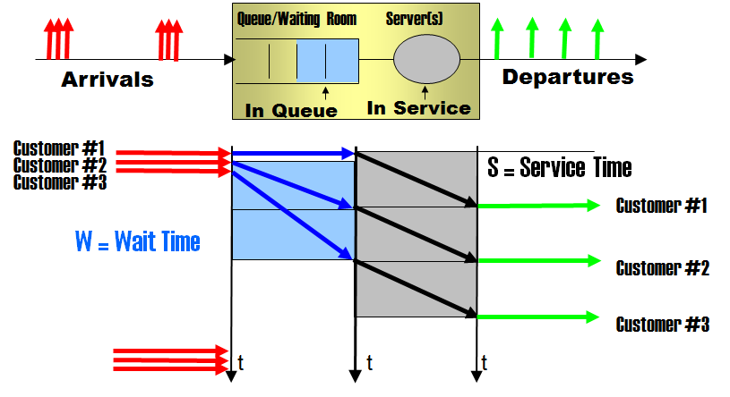
Let us build a reasonably simplified performance model for the caching in data tiering, a model suitable for a simple but illustrative performance analysis. A transaction "visits" the CPU, using C units of time (1 ms in the scenario), and "visits" the storage, using S units of time (20 ms in the scenario).


With a cache in place the same transaction may find the data in the cache -this is called a (cache) hit-, and in such fortunate case it doesn't have to visit the storage. This fast IO takes F units of time (5 ms in the scenario)


Two parameters to describe the cache effect:
  • α - efficiency  (0 <= α <= 1), defined as α=(S-F)/S or, equivalently  F=S(1-α).
  • h - hit ratio: (0 <= h <= 1), ratio of transactions that get their required data from the cache, typically proportional to its capacity.

KPI #1: Best Latency

Without the cache the best latency (response time) a transaction may achieve is Rmin=C+S units of time. With the cache in place, the best achievable latency reduces to R'min=C+F, corresponding to the transactions that get their IO from the cache.

In our scenario, the best latency with cache miss is 21 ms, and with cache hit is 6 ms.


KPI
No cache
With cache
Best Latency
C+S
hit:     C+S(1-α)
miss:           C+S

KPI #2: Bandwidth

Without the cache the bandwidth (best throughput) the system delivers is B=1/S, limited by the bottleneck device, the slow storage. With the cache in place the system is able to sustain a peak throughput of  B'=B/(1-h) for h<α and B'=B/(h·(1-α)) for h>α .

In our scenario, the bandwidth without cache is 1/20 ms-1, that is 50 transactions per second. With cache the bandwidth increases 11% for a hit ratio h=10%,  25% for h=20%, and 100% for h=50%.


KPI
No cache
With cache
Bandwidth
B=1/S
B'=B/(1-h)      if  h<=1/(2-α)
B'=B/[h·(1-α)]   if h>1/(2-α)

Here is a plot of the bandwidth gain with cache versus the hit ratio. The hit ratio that achieves the maximum bandwidth gain is h=1/(2-α), and the corresponding maximum gain is B'/B=(2-α)/(1-α).


Graph: bandwidth gain with cache (α=75%) versus the hit ratio

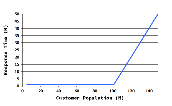
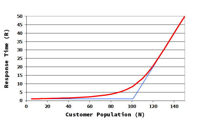
KPI #3: Response Time

The impact of the presence of the cache in the response time signature of the system, that is, the graph response time versus the number of users interacting with the system, is twofold:
  • a displacement to the right due to the increase of the saturation population, the point that marks the change of phase, and
  • a decrease in the high load slope.

Graph: response time versus the number of users


The consequence of these is that the the cache reduces the response time, a reduction that  is stronger in the high load zone. We must speak of averages here, as there are two response times now: one for transactions with IO is served from cache, and other for transactions with IO served from the slow storage.

In our scenario with a hit ratio of 10% the response time of the system drops from 1 s to 0.20 s with the same customer population (550 users).


KPI #4:Supported users


Looking at the response time signature from another point of view is clear that  additional users may work in the system while keeping the same level of performance (response time limit).

In our scenario the user population may increase from 550 to 611 users to reach again the limit of 1 s of average response time (see above graph).


Side effects

These performance benefits of caching don't come for free. Apart from the evident monetary cost, think about the following
  • The CPU usage increases: the cache alleviates the load on the storage but increase the load on the CPU, because if the CPU gets the data faster, it has more work to do. This may displace other cpu intensive work that may be competing for the CPU.
  • The housekeeping burden: cache housekeeping tasks (data load, data discard...) may consume CPU cycles, unless this task is offloaded to the storage.