Es mostren els missatges amb l'etiqueta de comentaris measurement. Mostrar tots els missatges

dilluns, 10 d’abril del 2017

Climbing the peak

Climbing the peak


Scenario

In your usual sizing efforts you need to know the peak usage% for a certain workload and server(s). What is the right averaging time to capture this peak? Let’s see possible choices.

Too long averaging time


Averaging Time = 500 min. Peak usage% = 50%.
Total loss of finer details. Does this really mean that the usage% has been the same for the 500 min? You, like me, don’t believe that!

Too short averaging time


Averaging Time =  10 s. Peak usage% = 100%.

Too much detail. This may be good for performance analysis, but it is confusing for sizing. Spikes goes up to usage%=100%, meaning that for 10 s -the averaging time-  in a row the server is 100% busy. But I wouldn’t consider that the server usage% is 100% for sizing purposes. If you do so you most probably are oversizing, a common (and safe) strategy by the way.

The right averaging time?


Averaging Time =  10 min. Peak usage% = 68%.

Eureka! This is the right amount of detail. In my point of view the right averaging time for OLTP lies somewhere between 10 min and 1 hour, depending on the workload, on the available data, and on the degree of tolerance to a high usage%.

dilluns, 20 de març del 2017

What does Usage mean?

What does Usage mean?


My objective today is to clarify the meaning of one of the most used metric in sizing and in performance analysis: the usage.

First things first

The Usage exposes the state of the service center. It is a binary quantity:
  • usage=0 when idle (not working)
  • usage=1 when busy (working)
Any service center at any point in time is idle (usage=0) or busy (usage=1).

Usage Percentage (Usage%)

This is the "usage" metric we are familiarized with. It is the average of the usage over a certain time interval, called the averaging time. Typically is expressed as percentage.

In example usage%=20% (for a certain time interval) means that for that time interval the service center has been:
  • 20% of the time busy
  • 80% of the time idle

Averaging Time

The averaging time for calculating the usage% is of capital importance. Saying 20% is not enough, saying 20% over an hour is right.

Theory is very simple, but in practice the averaging time is frequently dropped. Always ask for it (but don't expect to have a crystal clear response).

To stress its importance look at these graphs representing the time evolution of the usage% metric for the same workload and different averaging time.

Averaging Time = 10 s


Averaging Time = 10 min

Averaging Time = 500 min


I insist: in the three graphs the workload is the same (and the total amount of work done -the area under the usage% curve- remains the same). The short averaging time is best suited for performance analysis, the medium is for sizing, and the long is for trend analysis.

divendres, 11 de novembre del 2016

The scalability of the software


The developers team in the ABC company has just built a five star transaction / program. The program code has a critical region. Basic performance tests with a few users result in a the total execution time of 1 s, with a residence time in the critical region of 0.05 s. These numbers are considered satisfactory by the management, so the deployment for general availability is scheduled for next weekend.

You, a performance analyst's apprentice, ask for the expected concurrency level, that is, the number of simultaneous executions of the  transaction / program. This concurrency results to be 100.

What do you think about this?

A suitable performance model

A very simple model to analyze and predict the performance of the system is a closed loop, with two stages and fixed / deterministic time in each stage, as depicted here:


The total execution time of the program is divided into:
  • the time in the parallel region, where concurrency is allowed.
  • the time in the serial (critical) region, where simultaneity is not allowed..

With only one user (one copy of the program/transaction in execution) the elapsed time is P + S, that is, 1 s ( = 0.95 + 0.05 ).

But what happens when the concurrency level is N? In particular, what happens when N=100?

And the model predicts...

Calculating as explained in "The Phases of the Response Time" the model predicts the saturation point at N*=20 (=1+0.95/0.05) users. This is the software scalability limit. More than 20 users or simultaneous executions will queue at the entry point of the critical region. The higher the concurrency level, the bigger the queue, and the more the waiting time. You can easily calculate that with the target concurrency level of 100 users, the idyllic 1 s time measured by the developers team (with few users) will increase to an unacceptable 5 s level. This means that the elapsed time of any program/transaction execution will be 5 s, distributed in the following way:
  • 0.95 s in the parallel region,
  • 4 s waiting to enter the critical (serial) region, and
  • 0.05 s in the critical region.


Elapsed execution time for N=1 and N=100 concurrency level


The graph of the execution time against the number of concurrent users is the following:
Elapsed execution time against the concurrency level


And, in effect, when the program is released  the unacceptable response time shows up!

Corrective measures

The crisis committee hold an urgent meeting, and these are the different points of views:
  • Developers Team: the problem is caused by a HW capacity insufficiency. Please, growth (assign more cores to) the VM supporting the application and the problem will disappear.
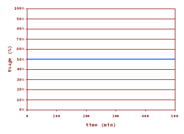
  • Infrastructure Team: hardware undersized? No point. The CPU usage is barely 25%! We don't know what is happening.
  • Performance Analyst Team (featuring YOU): more cores won't solve the problem as the hardware is not the bottleneck!  

Additional cores were assigned but, as you rightly predicted, things remained the same. The bottleneck here is not the hardware capacity. but the program itself. The right approach to improve the performance numbers is by reducing the residence time in the non parallelizable critical region. So the developers team should review the program code in a  performance aware manner.

You go a step further and expose more predictions: if the time in the critical region were reduced from the current 0.05 s to 0,02 s the new response time for a degree of simultaneity of 100 will be 1.5 s, and the new response time graph will be this one (blue 0.05 s, red 0.02 s):

Elapsed execution time against the concurrency level for S=0.05 ms (blue) and S=0.02 ms (red).

Lessons learnt

  • Refrain to blame the hardware capacity by default. There are times, more than you think, in which the hardware capacity is not the limiting factor, but an innocent bystander that gets pointed as the culprit.
  • Plan and execute true performance tests in the development phase, and specially a high load one, because with few users you probably will not hit the performance bottleneck.
  • Definitively welcome the skills provided by a performance analyst. Have one in your team. You won't regret.


divendres, 18 de desembre del 2015

Test Your Performance Skills - 2nd Part

Ten haircuts per hour is a measure of...
  • Response Time
  • Velocity
  • Throughput
  • Utilization / usage.


The throughput of a service center measures...
  • Units of work processed per unit of time
  • The elapsed time to process one unit of work
  • The elapsed time to process many units of work


The bandwidth is...
  • The average response time of many requests
  • The maximum achievable throughput


The response time can grow to infinity (I’ve seen graphs in which response time goes to infinity!)...
  • In practical cases
  • In theoretical models
  • Never
  • Always


Is possible to be at 100% cpu usage and, at the same time, to have an acceptable response time?
  • Yes
  • No


If we move a certain workload to a new server with half performance capacity of the original one, what will happen to the response time?
  • Increase slightly
  • Increase heavily
  • Simply increase (but cannot predict how much)
  • Remain stable
  • Decrease


To get serviced a customer has to visit two desks, A and B in strict sequence,  The customer spends 5 min in A, and 10 min in B. Which is the total residence time?
  • 5 min
  • 10 min
  • 15 min
  • 7.5 min (the average of 5 and 10 min)


Which is the bandwidth of the previous service center?
  • 9 customers per hour
  • 4 customers per hour
  • 12 customers per hour
  • 6 customers per hour


You, as a great performance analyst, has been asked to place an additional clerk (to work in parallel) in one of the desks, A or B. Where would you place him/her?
  • At the entrance (for marketing purposes)
  • Desk A
  • Desk B
  • At the exit (for customer satisfaction feedback)


What of the above sentences truly quantify the improvement of your previous recommendation, if any.

  • There is hardly a performance gain
  • The new residence time is 10 min
  • The new bandwidth is 12 customers per hour
  • The new throughput is 12 customers per hour
  • The new bandwidth is 6 customers per hour

divendres, 5 de desembre del 2014

SAPS Olympics: 10 charts for fun and profit

I’ve prepared 10 charts I think they are interesting enough. You may use them for your fun or your professional presentations. Of course the data source is the official SAPS (SD 2-Tier) results posted at http://global.sap.com/solutions/benchmark/sd2tier.epx. Please, feel free to ask for additional charts not included here, as I plan for new ones.
The list here:
  1. Count of benchmarked systems by benchmark version.
  2. All the SAPS results.
  3. All The SAPS results (logarithmic scale).
  4. The latest SAPS results (logarithmic scale).
  5. Top 1 SAPS evolution.
  6. SAPS evolution (50 benchmarks moving average).
  7. SAPS evolution (50 benchmarks moving average) (logarithmic scale).
  8. All the SAPS per core results.
  9. SAPS per core evolution (50 benchmarks moving average).
  10. Top 1 SAPS per core evolution.
 

Chart #1: Benchmarked systems by benchmark version

 
image


Chart #2: All the SAPS results

 
image


Chart #3: All the SAPS results (logarithmic scale)

 
image


Chart #4: The latest SAPS Results (logarithmic scale)


image


Chart #5: Top 1 SAPS System Evolution


image


Chart #6: SAPS evolution (50 benchmarks moving average)

 
image


Chart #7: SAPS evolution (50 benchmarks moving average) (logarithmic scale)

 
image


Chart #8: All the SAPS per core results

 
image


Chart #9: SAPS per core evolution (50 benchmarks moving average)

 
image


Chart #10: Top 1 SAPS per core evolution

 
image
 

dijous, 27 de novembre del 2014

SAPS Olympics: 10 years ago

Let’s go back around ten years, what did happen in the SAPS arena back then? In this analysis I have considered the 130 systems that were measured with the SAP R/3 Enterprise 4.70 benchmark specification. The first one was in 2003 April 4th, a Mitsubishi Apricot with certification number 2003032, and the last one was published in Jul 4th 2005, an Egenera pBlade 950-000084 with certification number 2005037. That is, more than two years of time span. All the numbers and calculations are based on the official SAPS (SD 2-Tier) results posted at http://global.sap.com/solutions/benchmark/sd2tier.epx.


Remember that you have to be careful when comparing two SAPS values if they correspond to two different benchmark specs. You have to take into account software release effects and other benchmark specs changes. This is like the need to take into account the inflation rates when comparing the value of year 2008 dollars to year 2014 dollars. Current SAPS are heavier than past ones.

SAP Technology Partners

The SAP Technology Partners (a SAP concept) that were actively benchmarking SAPS. Fujitsu sometimes appears alone and sometimes with Siemens, but I’ve grouped both in the count.


By CPU family

The Intel Xeon was the dominating family, and this is a constant in the history of SAPS Olympics. AMD Opteron had strong presence. Intel Itanium was alive, and they were also IBM POWER5, UltraSPARC IV, SPARC64 V, and PA-RISC times.


By Operating System

Operative systems seen: Windows Server 2000 and 2003, IBM AIX 5, Solaris 9, Linux SLES 8, and HP-UX 11.


By Relational Database Management System

Relational Database Management Systems seen:  Microsoft SQL Server 2000, IBM DB2 UDB 8 and 9.5, Oracle 9i and SAP DB. All of them transitioning from 32-bit to 64-bit flavors.


Absolute Number of SAPS (SAPS per system)

Gold -> Fujitsu PRIMEPOWER 2500 with 128 SPARC64 V @2080 MHz processors: 105820 SAPS.
Silver-> IBM eServer p5 Model 595 with 64 POWER5 @1900 MHz: 100700 SAPS.
Bronze -> Sun Fire Model E25k with 72 UltraSPARC IV @1200 MHz: 51070 SAPS.
The last ->  Fujitsu Siemens Computers PRIMERGY Model BX300 with 1 Intel Pentium M @1800 MHz: 830 SAPS.


SAPS per core / per thread

In those days the processor and core terms were managed by marketing and, consequently, blurred and misdefined.  The problem is that sometimes processors are equal to cores, and sometimes they are not. In the SAPS official table the cores (and threads) column are zero, and only the processor column is filled. Thus, I cannot offer a significative analysis unless I take big time analyzing system by system (and that is not in my near scope.